滑鼠和超連結
原始碼(css_alink.html)
<html>
<head>

  <style>
/* unvisited link */
a:link {
  color: red;
}

/* visited link */
a:visited {
  color: green;
}

/* mouse over link */
a:hover {
  color: hotpink;
}

/* selected link */
a:active {
  color: blue;
}
  </style>
</head>
<body>
 <a href="xxx">測試這個連結</a>
</body>
</html>hover 小範例
- :hover 的應用
<style>
  h2:hover .xxx,
  h3:hover .xxx {
    visibility: visible;
  }

  .xxx {
    color: #00bdf3;
    font-size: 0.5em;
    cursor: pointer;
    visibility: hidden;
    margin-left: 4em;
    position: absolute;
    margin-top: 0.5em;
  }
</style>

<h2>xx <span class="xxx">sss</span></h2>
<h3>yy <span class="xxx">sss</span></h3>
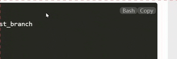
toobar on code
div.code-toolbar:hover > .toolbar {
    opacity: 1;
}

div.code-toolbar > .toolbar {
    position: absolute;
    top: .3em;
    right: .2em;
    transition: opacity 0.3s ease-in-out;
    opacity: 0;
}
div.code-toolbar > .toolbar a,
div.code-toolbar > .toolbar button,
div.code-toolbar > .toolbar span {
    color: #bbb;
    font-size: .8em;
    padding: 0 .5em;
    background: rgba(224, 224, 224, 0.2);
    box-shadow: 0 2px 0 0 rgb(0 0 0 / 20%);
    border-radius: .5em;
}
<style>
  div.code-toolbar{
    position: relative;
    background:black;
    color:white;
  }
  div.code-toolbar:hover>.toolbar {
    opacity: 1;
  }

  div.code-toolbar>.toolbar {
    position: absolute;
    top: .3em;
    right: .2em;
    transition: opacity 0.3s ease-in-out;
    opacity: 0;
  }

div.code-toolbar>.toolbar a,
  div.code-toolbar>.toolbar button,
  div.code-toolbar>.toolbar span {
    color: #bbb;
    font-size: .8em;
    padding: 0 .5em;
    background: rgba(224, 224, 224, 0.2);
    box-shadow: 0 2px 0 0 rgb(0 0 0 / 20%);
    border-radius: .5em;
  }
</style>

<div class="code-toolbar">
  <pre><code>
     這是程式碼
     這是程式碼
     這是程式碼
  </code></pre>
  <div class="toolbar">
    <button>Bash</button>
    <button>Copy</button>
  </div>
</div>
動畫
移動到img時放大1.1。
img:hover {
    transform: scale(1.1);
}